Heuristic evaluation
that actually scales.
AI personas evaluate your interface like experienced UX reviewers — checking visual hierarchy, mobile responsiveness, accessibility, and cognitive load across every page, after every deploy.
Good design at launch. Degraded design by sprint 5.
You design with intention. But implementation drifts, mobile gets overlooked, and accessibility regressions creep in faster than you can review them.
“The implementation doesn’t match the design”
Spacing is off. Font weights are wrong. The responsive behaviour doesn’t match what was specified. Developers interpret, and details get lost.
“Nobody tests mobile properly”
Chrome DevTools responsive mode isn’t the same as real mobile UX evaluation. Touch targets, thumb zones, scroll behaviour, and viewport-specific layouts need dedicated testing.
“Accessibility keeps regressing”
You fix WCAG issues. Next sprint, new ones appear. There’s no continuous monitoring, and automated tools catch syntax violations but miss experiential barriers.
“I can’t review every page after every deploy”
20+ pages, 3 breakpoints each, new features every sprint. Manual heuristic evaluation doesn’t scale. Things slip through because there aren’t enough hours.
“Users say it’s confusing but I can’t see why”
Cognitive load issues are invisible to designers who know the system. Information architecture makes sense to you because you designed it. Fresh perspectives are expensive.
“User testing takes weeks to schedule”
Recruiting participants, scheduling sessions, synthesising findings. By the time results come back, you’ve already shipped. You need feedback in the same sprint you’re designing.
Review. Evaluate. Iterate. Monitor.
Like having a senior UX reviewer on call — for every page, every deploy.
Review
UX Quality Reviewer evaluates visual hierarchy, consistency, typography, and interaction patterns across every page.
Professional heuristic evaluationEvaluate
Mobile UX Tester and Accessibility personas catch responsive issues, touch targets, tab order, and screen reader context.
Goes beyond automated scannersIterate
Fix issues, re-run. UX Confidence, Visual Quality, Accessibility, Cognitive Load, and Mobile Usability scores update with every run — giving you concrete proof your changes worked.
Before/after comparison built inMonitor
Schedule post-deploy checks. Track design quality trends across sprints and get alerted when a code change breaks your carefully designed layout or interaction.
Scored metrics tracked over timeThe kind of feedback that usually takes a senior reviewer.
“Visual hierarchy breaks on the pricing page — all three tier cards have equal visual weight. The recommended plan needs stronger differentiation through size, colour, or elevation.”
“Navigation drawer has 14 items with no grouping. The search icon is in the top-left (unexpected position). Footer links require excessive scrolling past repeated content blocks.”
“Form error messages appear visually but aren’t announced to screen readers. Focus doesn’t move to the error, so keyboard users won’t know their submission failed.”
“The settings page presents 23 options without categorisation. Users must read every label to find what they need. Group by function and add section headers.”
Every page gets a structured design review — visual hierarchy, consistency, typography, accessibility, and interaction patterns scored and explained with actionable recommendations.
Fits into your existing design process.
After design handoff
Check if implementation matches design intent. Catch visual regressions early.
After every deploy
Scheduled runs catch when new features break existing design patterns.
During design exploration
Test prototypes on staging. Get structured feedback before committing.
Design system audits
Check consistency across pages. Spot where components deviate from standards.
Mobile QA pass
Dedicated mobile evaluation of every key page. Catch what DevTools doesn’t show.
Accessibility sprint
Baseline your site, fix issues, re-run. Track WCAG improvements over time.
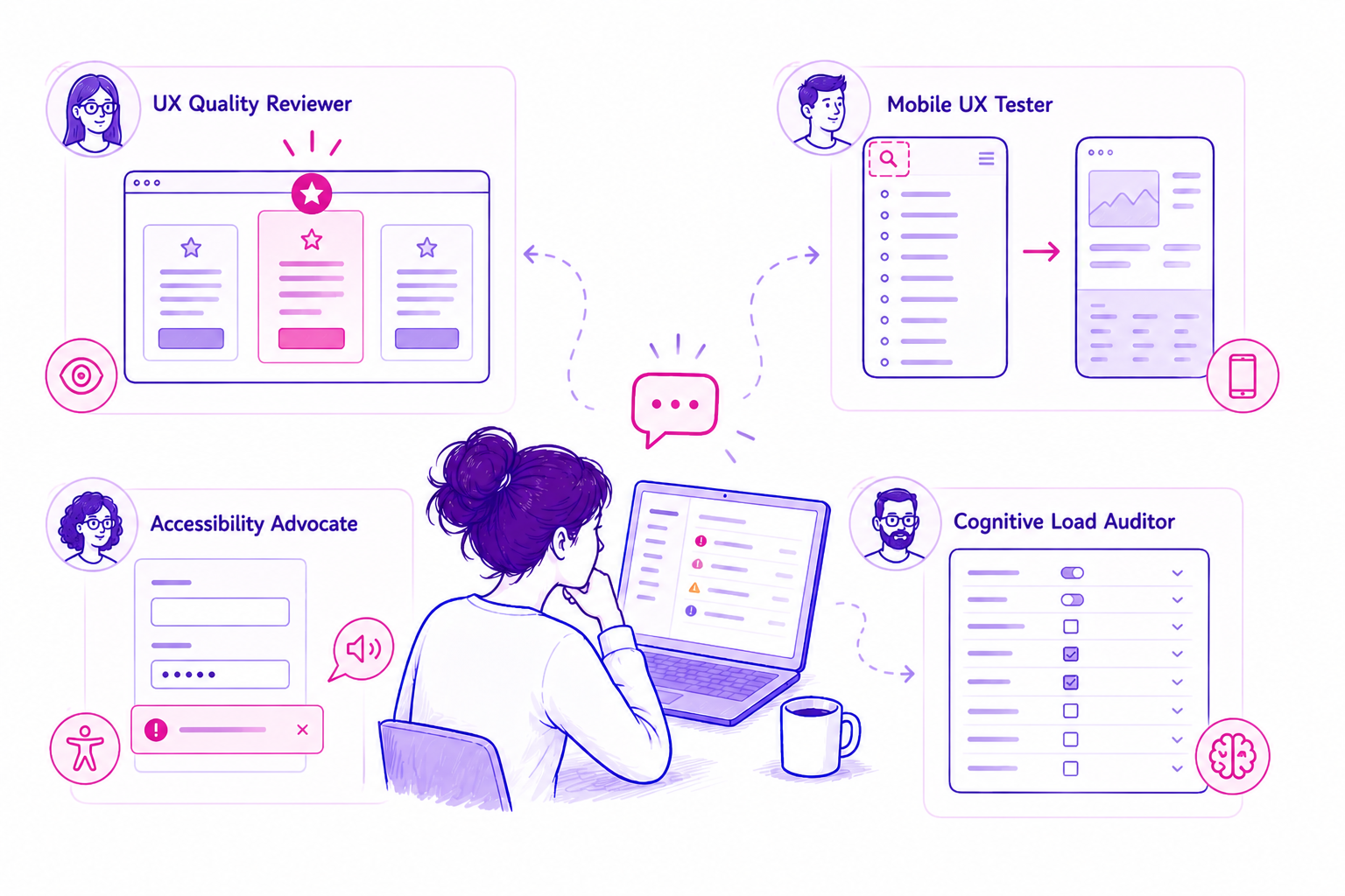
The personas built for design teams.
UX Quality Reviewer
Evaluates visual hierarchy, spacing, typography, colour usage, consistency, and information architecture to professional design standards.
Your automated design reviewer.Mobile UX Tester
Tests at mobile viewport widths. Evaluates touch targets, thumb zones, content reflow, horizontal scroll, viewport-specific layout issues.
Real mobile evaluation.Accessibility Advocate
Goes beyond automated scanners. Evaluates keyboard navigation, screen reader experience, focus management, meaningful alternatives.
Experiential a11y testing.Cognitive Load Auditor
Evaluates information density, decision complexity, navigation depth, labelling clarity, and visual noise that overwhelms users.
Complexity reduction.First-Time Visitor
Tests first impressions: “Do I understand what this is? Can I find what I need?” The fresh perspective your team can’t simulate internally.
Fresh eyes on demand.Journey Completion
Guided flow testing through multi-step journeys. Evaluates each step for clarity, progress indication, error handling, and friction.
End-to-end flow testing.What automated tools miss, PersonaQA catches.
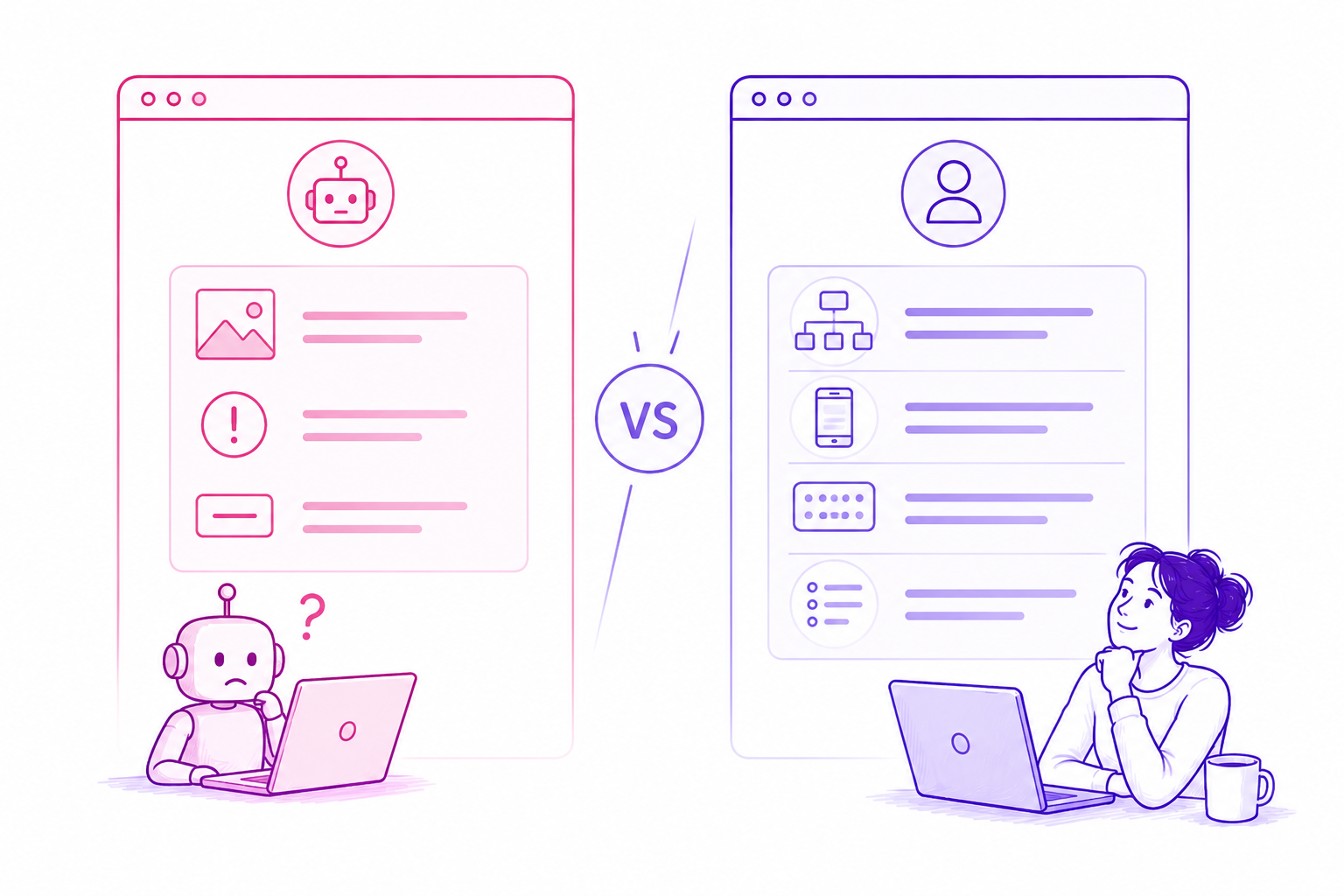
Automated scanners tell you:
- “Image missing alt text”
- “Contrast ratio 3.8:1 (fail)”
- “Button has no accessible name”
PersonaQA tells you:
- “The navigation hierarchy is flat — users can’t tell primary from secondary actions”
- “On mobile, the CTA requires scrolling past 3 content blocks to reach”
- “Tab order jumps from header to footer, skipping the main content area entirely”
- “The settings page has 23 ungrouped options — users feel overwhelmed”
Cheaper than one usability testing session.
A single moderated usability test costs £500–£1,500 and takes 2–3 weeks. PersonaQA runs in 5 minutes and gives you structured feedback from multiple UX perspectives — on demand, whenever you need it.
Frequently asked questions
Why not just ask ChatGPT / Claude etc. to “review my website”?
AI chat tools can interpret content but don’t run structured, repeatable tests in a real browser. PersonaQA uses full browser automation to simulate real journeys, capture screenshots, log errors, track performance, and collect structured telemetry. AI can read a website like a menu — PersonaQA can directly interact, test, measure, and compare it over time like a real user would.
But simulated users aren’t real users — can I trust the results?
Good question — but a better one is “is it valuable?” Most signals you already rely on aren’t perfect either: analytics is aggregated, heatmaps are partial, and A/B tests only show outcomes. You use them because they help you make better decisions, not because they’re exact. Simulation surfaces likely friction points early - where users might get confused, hesitate, or lose trust. Those signals are directionally useful and often catch issues other tools miss. It’s not a replacement for real users, it’s a hypothesis layer before experimentation that helps you ask better questions and validate them properly.
Is this a replacement for real user testing?
No — it’s a complement. Use PersonaQA for continuous monitoring, quick heuristic checks, and post-deploy validation. Use real user testing for deep behavioural research and complex task analysis.
How does the mobile testing work?
The Mobile UX Tester uses a real browser at mobile viewport dimensions. It evaluates the rendered experience — touch targets, content reflow, horizontal overflow, and viewport-specific layout issues that only appear at smaller widths.
Does the accessibility testing replace axe or Lighthouse?
It complements them. Axe catches code-level violations (missing ARIA labels, contrast failures). PersonaQA catches experiential issues — confusing tab order, poor focus management, missing context for screen readers. Use both.
Can I test staging/preview URLs?
Yes. Any publicly accessible URL works — staging environments, Vercel previews, Netlify deploys. Test before it goes to production.
Can I share reports with developers?
Yes. Reports include specific page references and descriptions of issues that developers can act on directly. Use them in sprint planning or attach to tickets.